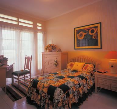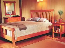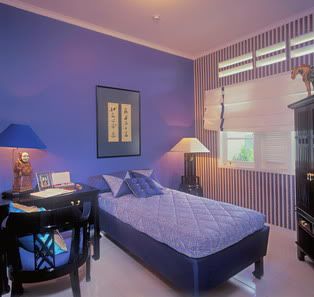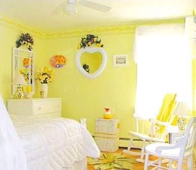
Yellow can be stimulating. What about the other colors?
Sleep is activities that are absolutely made in the day to re-charge your mind and energy. Sound condition or not someone is called the sleep quality of sleep.
One of the factors that can affect the quality of sleep is a condition of bedrooms. Cat who is one of the components bedrooms, of the influence that was quite important in determining the quality of someone sleeping. In general, the space characters to create a better quality of sleep is the maximum that is calm, both physically and emotionally. Character and this can usually be well by colors of cool and pastel colors. Cool colors are used to the usual bedroom wall color is a soft gradation of green and blue.  However, this does not mean price, for that room, must be selected with a green tone paint or blue. Maybe for you the day-to-day has been very active, the colors green and blue nuances are very suitable for improving the quality of sleep. But for you, including the passive group, may require more colors such as yellow, the spirit or peach.

According to Imelda Akmal Sandjaya, the author of the book up Art House: Bedroom, there are four factors that must be considered in choosing colors to paint the bedroom.
Psychological
According to color psychology, to get a calm effect, you should use colors from the cool colors such as blue and green. In addition, you can also choose the color shade of the color "earth" or ground (earth tones).
Architecture Design
To determine the color of paint bedrooms appropriate, must also consider the overall home architecture. Would damage the sustainability of design, when in the midst of ethnic-style house, appears with a bedroom wall color nuances candy.
Trend
For some people who like to follow trends, and also like the change-house interior, one of the factors is essential to consider, so that is not considered out of fashion.
Character of the Room
As reviewed above, it is the color paint bedroom character adapted to the owner. Including whether the person needs to "be" or otherwise take "heat". Here are some colors that are used for many bedrooms. Should not choose a color block or dark, because it gives the impression "hit". Yellow
Color to give the impression that this pure spirit to increase according to the group of people from passive. Color is also suitable for the prevailing lighting bedroom less. Yellow is very fitting, if combined with a blue, beige, white and yellow gradation.
Blue
This is the color to give the impression that cool and calm. Gradient blue light to give the impression there is open and the flow of air in the room. For the best combination, Pair with beige and white.
Purple
This color is a mix hot colors (red) and cold (blue). Therefore, purple, lavender purple, especially, to give effect balance. Meanwhile, purple and violet are muted to the point of rest. Gradient purple appropriate if combined with a pink or beige.
PINK
In psychology, pink trusted to give effect and the optimistic mood for the good of it. For best results, Pair pale pink roses with pink or salmon pink and beige, and the neutral colors (white, gray). GREEN
Green is the color of nature. Cause this effect color shade and fresh. Results for the harmonious, Pair with blue, yellow, cream and beige.
Aqua MARINE / Turquoise
Mix green and blue gives the impression relieved in the room. Ideal for bedrooms because "invite" people to rest. Colors are consistent with the color of sage (gray green) and cream. Yellow is healthful

IF INCIDENTAL fruit or the hearts you are suffering from mental illness and need care at home in that time period long enough, there's a little tip for you that may help accelerate the healing of the sick. Tip is to change the wall paint or interior room with the feel of the pain mastic. Why yellow and not white or blue-green paint as the walls in the hospital? Maybe some of you will submit a question.
According to research conducted by the University of Delaware, the color yellow can accelerate the healing process. The psychological, yellow in the young and soft gradation, will create a fun atmosphere and comfort for the pain to rest physically. The maximum physical break will help accelerate the healing process. But on the other hand, a pure yellow color will still provide stimulus or stimulus light on the mental illness so that they remain active. Thus, bad mood due to boredom and depression in pain because of the activities can not be as usual, at the reduction.
This also affects the mental condition after the healing process thoroughly. If during the treatment, the pain still get mild mental stimulus, and when cured, can return to normal activities such as adaptation does not take too long.
For best results, select the color yellow or the young and rather soft yellow light of the old and unsightly. Application of color is not solid or block, to avoid the effect of pressing on the pain.
It is important to learn how to influence the color of ourselves. This is because the color has a visual and emotional for its observers. In addition to the value of beauty, unconsciously color can affect the process of someone thinking, mood, and even help the process of healing. Why? Each color of light emit a specific wavelength. Emission wave produces energy that will be in touch with one of the disc's seven main disc of our own. Colors that received the body will work to balance the disc-disc that is not balanced.
You may never know about the image you can capture the human aura. Results aura photo is presented in color. Each color comprehend how the mood. For example, if a red aura means that people are in a state of angry, annoyed, or disappointed. If green, it means that in calm conditions.
There is no compulsion in choosing colors. We can just experiment or choose the color according to taste. When the fuse, you can only use insting and experience. However, if the "science" has not been enough, consult with a color expert. In the case of the color space, then consult with the interior designers.
The explanation above is a description of how we select a color effect on our mood. But do not make it as an obstacle in choosing a color that you like. Free is any color. Keep it in the knowledge that you have. Do not forget to always put the accent colors in the room. Accents complete the atmosphere of the room, as you wear. There is always the accent to make it more alive and expressive.
Learn More..
 Color may cause a certain effect, even the mood or feelings of men. Some colors can have a stimulating, there are colors that calms the emotions. Colors that match the personality and needs, can bring physical comfort, mental and spiritual. Color can also heal and to balance the emotions, which in turn will create harmony in the house. Here are some color effects in humans: 1. Red. This color can generate energy, warm, communicative, active, optimistic, and enthusiastic spirit. Red prepossess sensual and luxurious, to improve the flow of blood and the body that are associated with ambition. But, too much red can stimulate anger and agresivitas. 2. The Old Red. This color is a red color gradation younger called pink or pink. Pink is the color of a warm, emotional, but also soft and calm. This color is not only symbolizes the feelings of affection and love, and childlike.
3. Orange. This is a character similar to the red, but more feminine and friendly. Color that symbolizes the socialization, full of hope and confidence. Orange or orange can also raise the spirit, vitality and creativity. Can cause a feeling positive, happy, happy, optimistic and full of energy. Orange can be trusted to reduce feelings of depression or depressed, even when it is too over-stimulating behavior hiperaktif.
4. Yellow. Like the color, bright, generate energy and mood. Yellow omen spirit and vitality, communicative, encouraging self-expression, to provide inspiration and facilitate the logical thinking ability and stimulate intellectual. This color is suitable as a color accent in the living room or study. However, the use of yellow exact cause less intimidating impression.
5. Green. Color is usually associated with the refreshing nature, generate energy and also able to give effect calm, soothing and balancing emotions. This is a very elegant color, heal, encourage feelings of empathy towards others. Nuance of green can ease stress, to provide security and protection. Unfortunately, the green also cause a feeling trapped.
6. Blue. Not be separated from the elements water and air, the association with nature, symbolizing harmony and gave the impression field. Use of blue can cause feelings of calm and cold. Birth feeling cool, tranquil, serene, peaceful, and protection. Color is often associated with the effect of ethnic, antique, country style. Blue color is strong, intuitive ability to stimulate and facilitate meditation. But be careful, because too much blue, can cause lethargy.
7. Purple. Close to the spiritual atmosphere of the magical, mystical, mysterious, and able to attract attention. Therefore, purple is used by many notables. Color is also impressive sensual, feminine, lovely, elegant and warm. Dark purple that can radiate strength, can increase the power of intuition, fantasy, imagination, creative, sensitive, inspired and obsesif.
8. Brown. This color is the color of natural, warm, and return to stable. Brown to bring comfort, giving the impression graceful and elegant. Can provide confidence and security, the familiar color or familiar and calm. Brown can also encourage a commitment, but also can be heavy and stiff when too many.
9. White. Symbolizes purity and smoothness, protection, comfort, and facilitate reflection. However, too many white, can cause feelings of cold, sterile, stiff, and isolated.
10. Black. Color this one have a strong and full of confidence, full protection, masculine, elegant, majestic, dramatic, and mysterious. But black is also the color of mourning omen and can cause feelings of depression.
11. Gray. This is a neutral color that can create serious effects, but also gives rise to feeling comfortable and peaceful. Impression of a gray, among others, independent and stable, and still create an impression knowledgeable. But gray is also impressed cold, stiff, and not communicative.
Learn More..
Color in the circle, there is the term hue, the color original. Original color, whether primary, secondary, and tertiary, can be grouped into two major groups, namely groups of hot colors and cold colors. Color is among the hot yellow to red purple. Meanwhile, the color purple from the cold to sulfur. * Color generate heat and hot sensation near. Color is the symbol of the spirit, cheerful, and anger. Red have a strong attraction. Color is also striking distance of the near future. * Color of the cold summer color. Color is the symbol of softness, coolness, and comfort. Cool colors striking distance of the remote.
In the color value, we recognize the color of light and dark color:
* Colors are more bright young people. This color has the impression that a full and cheerful spirit. The colors are bright, among others, yellow, red easy, orange, red orange, and colors other tint. Most of the colors used for this room, modern style, contemporary, or the special young people.
* Color black or dark colors that have scattered power is very low. This color to make an object appear more serious. Dark color is widely used in home-style rural (country) or the classic. Including the darker color, among others, blue, purple, green, brick red, or colors other shade.
In addition, there is also the so-called neutral colors and color contrasts:
* Color is a neutral color that range from black to white. Colors of the family, including a gray color that is secure, including applied. This is because they can mingle in harmony with any color.
* Color is a color that contrasts to its opposite effect one another. To see the color contrast, image circle in a triangle color primary, secondary, and tertiary. Located opposite each color contrast (the triangle cut off point) and the directions refer to the primary color with secondary color or colors other tertiary with tertiary. For example, red with green, yellow, with purple, red purple with sulfur, and blue with orange.
Learn More..
 World children not be separated from the play and learning. Personal space is adjusted to the world. And there a lot of toys, full of cheerful colors. Children's room a different color with the color room adults. Room for your child can use the primary colors. Primary colors of red, yellow, and blue. They can stimulate movement and motor development of the child's brain. However, the primary colors is not always "be" applied in the nursery. To apply the need to consider the age of his children.
Primary color is suitable for children under the room in three years. This helps children recognize basic colors. But if they go big, for example, age 4-11 years old, a room should use the secondary colors and color young. Reasons, so that children can be pushed to be more quiet.
Color combinations in the children's room at the top of 12 years may be more. Entering the turn of age that, you can apply the colors that have a psychological meaning in accordance with the child's sex. For example, if the room was a woman, polish, such as a feminine color pink or light green.
What color elements forming the child's bedroom? Like other rooms, the main element is the element space itself, ceiling, walls, and floors. One element, such as walls, can be colored color primary. Then use the combination with a neutral color, such as white or beige. This color combination should not more than three colors. For example, the white ceiling, blue walls, floors and wood color.
In addition to elements of space, furniture, accessories, and various children's toys can also form the color room. Furniture should have the same color with the color space. Then the furniture accessories added as accents that do not seem sincere.
To give an impression attractive, use the accessories and children's toys. Both generally have a combination of primary colors that contrast. Color accessories and toys can also be accents in the room. Put on some corners, for example, a corner table, shelve, or on the table to study, to appear prominent.
Learn More..
 Color is traditionally assumed to be the color of women's feminine personality at once a mystery woman, who became a good choice for the marketing message, website, and interior design. There are results of surveys Joe Hallock, Color Matters Research Analyst, who found that most women's favorite color into the cool color, like blue, purple, or all the cool green color. Maybe some color on the bottom of this is your favorite, especially for you, the women.
Blue: the color is a favorite for both men and women and for all ages. When men have more options than women for the blue, but blue is the top choice. Blue has an effect that can create feelings of calm. This makes the popularity of the color blue has been increasing among women.
Green: Nature is green and she is a woman. Green is the color favored, for both men and women. Green is the color that exude peace, cool, illustrates the significant growth, renewal, health, and environment.
Turquoise: Based on the 1964 study of Color and Gender, found that women more like blue-green (aka Turquoise) than men. The same study also found that approximately 76% of women prefer a cool color, and Turquoise is a blend of two colors cool color, blue and green.
Purple: Purple is seen as a feminine color because color is an option exclusive to women. Purple is the favorite color for women, but a color that most men by the doghouse. Purple symbolizes the spiritual, romantic, and mysterious.
Pink: Most people assume that the color pink as a feminine, a color for the little girl. Pink color and women as a strong cultural association. However, although the color pink so this is not the ideal color for men.
Lavender: another version of the pink, but you have a cool color and is a bright side of purple. Lavender color normally associated with women's soft and can generate a sense of Nostalgia or romantisme women. A 1990 study from the Color Matters Research, found that between the bright colors and soft color, women prefer soft colors such as pink, lavender and other pastel colors.
Learn More..
|
|
